Some covers tend to focus on the text and the name of the book/ author. I think this is used a lot where the author is well known and therefore this has to be prominent and the illustration isn't seen as crucial in drawing attention. Other books use photographs with text, some have simple stylized image (particularly in contemporary women's fiction), others are more simplistic and abstract and give a sense of the mood/ genre of the novel.
I think the last one is most difficult to portray in an illustration and I think it is a real acquired skill to be able to summarise or attempt to capture the essence of a book in a single cover illustration. I think the covers for particularly complex themes or stories are often kept quite generic and don't automatically give an insight to the novels plot.
Needing a starting point I decided to make an alternative mock- up for a book I've recently enjoyed called "The Boy who Fell to Earth" by Kathy Lette. The story focuses on Lucy and her son Merlin who is autistic and how he relates to the world and Lucy's relationships with her ex-husband and ageing rocker boyfriend. I feel that the chosen cover for the book is quite lighthearted and perhaps a bit "chick-lit" with the use of colour choice and feminine designs.
 |
| Original cover |
I wanted to try include a character of Merlin and set about trying to represent him in a childlike / cartoon like way as I felt this reinforced some of the qualities of Merlin in the novel who loved hugs.
I looked at various ways to draw figures and liked the simplisitic work of Harriet Russell and Quentin Blake. I experimented with composition in my sketch book and produced a sheet of character sketches. At first I thought I wanted to show a boy falling to earth but didn't quite feel these were working so decided to show a boy on earth with his arms wide open.
I chose a text which I thought also reinforced this feel and added an earth image which I had used in one of my personal projects. After much experimentation with photoshop I came up with the image above and think it works at representing the character and although the "Boy who fell to earth" isn't the literal story of the book I think that the earth image represents Merlin's world.
After showing the illustration above to a friend (who has art school behind her) I thought that the figure needed slightly revising as his arms looked pretty unnatural. I really want to practise drawing people but wonder in this sort of image how important is it that the figures shape is realistic?
For example this sort of work by Harriet Russell in which the figures bodies aren't accurate.
Harriet Russell - Online Image Accessed 29th October 2012 http://www.harrietrussell.co.uk/
I want to get some advice from my tutor about this.
However, I wasn't totally satisfied and wanted to experiment with a few more covers taking a different tact. I particularly like the effectiveness of some more illustration covers and wanted to give
something else a go.
I looked at the redesign of pengiun novels by Vladimir Nabokov.
Illustrations: Ada or Ardor by Agnès Decourchelle and Transparent Things by Masumi Briozzo
Illustrations: Look at the Harlequins by Masumi Briozzo and Nikolai Gogol by Christina Christoforou
Online Images available via http://new.pentagram.com/2011/05/new-work-seven-new-nabokov-cov/ Accessed 21st October 2012
The Vladimir Nabokov series were illustrated by a series of illustrators including Peter James Field and Agnes Decourchelle yet all have common background patterns and classic text.
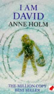
One of my favourite childhood books was a novel named I am David by Anne Holm which tells the story of a boy who has escaped from a concentration camp with the help of a guard with little more than a letter, a loaf of bread and a compass.
The original cover is shown below.

Online image available from http://openlibrary.org/works/OL4791389W/I_Am_David
I had the idea that perhaps a background map image and compass with simple lettering would represent the journey the boy makes. I tried some experimentation with a scanned map image and a compass illustration(which I wasn't particularly happy with). I felt that in both these book mock- ups I had ideas but found it hard to come up with a good illustration to communicate the idea in terms of the technical drawing behind it.
I tried some more versions this time thinking about a boy holding a compass with the barbed wire showing his struggle to escape the ties of the concentration camp.
Stripped background - prison like idea?
For the image below I drew a page of barbed wire and was trying to create something more graphic a bit like some of the Coraline illustrations for the Penguin horror series. I think the idea has promise but not quite.
I think I like the image below best showing the boy looking into the distance through some wire with a slightly wood effect backdrop.


No comments:
Post a Comment