I began as per the brief by looking at jazz images and posters and created a few mood boards with some colour palettes included.


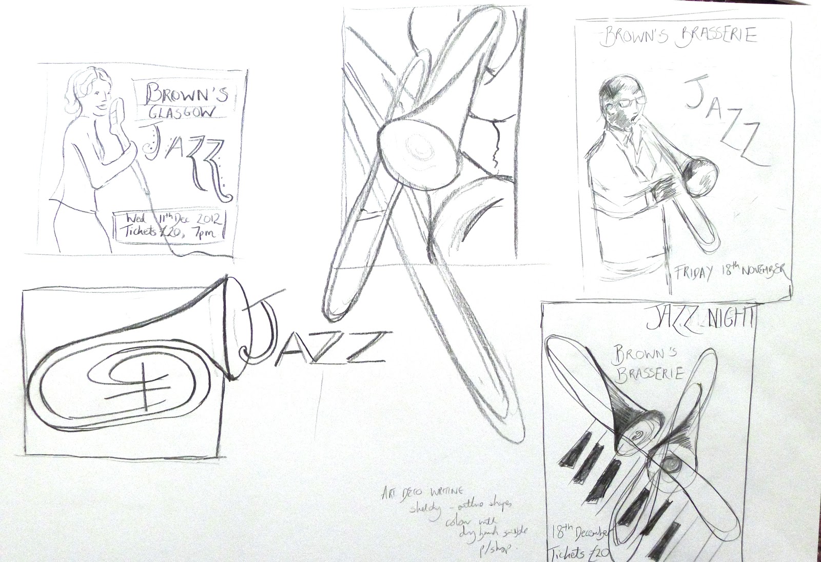
I then went on to produce thumbnail sketches in both my sketchbook and on paper considering different compositions / components and including text to see how they would work together.
The assignment called for us to begin by producing a range of thumbnails based on our mood boards etc. I experimented with various compositions in my sketchbook and on larger sheets and then decided I want to try drawing out some of these elements in more detail to see how they would fit/ look within the composition as I thought the quality and type of illustration would play a key part in whether the illustration and overall composition were pleasing.


I had the idea of a female jazz singer singing showing the emotion in her face etc and having this as either an outline or silhouette. I tried a few images one of which I couldn’t get the woman’s hands correct so abandoned. The other image worked better using blue and black pencils and crayon to create a textured drawing. I wasn’t entirely happy with these so continued with a lot more experimentation drawing various jazz images/people using watercolours to create an almost sketch like representation , pastels and a more tonal based piece.
In between working on these pieces I continually was thinking about composition and what sort of illustrations would fit within the various compositions I had tried.
I decided at this point to narrow down my choices and produced line visuals for three potential posters. The first was the female singer outline, the second a jazz character playing a saxophone (I had debated having a female dancer within this composition) and the third a more abstract jazz outline which I thought might be quite effective/ strong.


The next stage involved a lot of experimentation in Photoshop with my selection of images at creating a pleasing composition – thinking all the time about appropriate text/ placement of text to lead the viewer into the image and how to make the illustrations work with backgrounds.
At this point I was also thinking about colour palettes and as per advice given before from my tutor decided to quite selective in colour choice for each potential poster. I selected some colours from my mood board and looked at old jazz posters for combinations. I liked the idea of having something quite moody with maybe some vibrant colours added rather than very bright primary colours. I also worked at
Photoshop experimentation was really useful for composition considerations and colour palettes and I also tried to render colour digitally (which took a little practise – I’ve yet to fully master doing this in illustrator!) . I also tried to do a colour range selection from my drawings where I took the main shadows and highlighted areas and filled them with colour.
I came up with a huge selection of images/ files I was working on and decided I really needed to be selective.
Thoughts on images below – what was working/ not working.


In the end with this assignment I got to a stage where I really felt I had to stop. I think my downfall here was having idea overload and at times going off on a tangent with new ideas as I worked. That being said I did think I produced some vibrant jazz posters although I did struggle to pick the overall final piece. I think that with time and practise this will come easier as my style develops and I know what sort of piece/ style I am most successful producing.
The use of a selected colour palette I think helped to bring the posters together. I think my abstract mock- up was interesting and quite attention grabbing but overall for some reason I feel that the man and saxophone image is slightly more successful as a finished piece. I found it hard to make sure the figure worked against the background but after a lot of experimentation I think the poster is reasonable successful through use of subject, colour palette and appropriate typography.
In the end it was a close decision between either the jazz lady singer or the saxophone man image as I think these were both quite strong through use of colour choice - fonts etc. However, in the end I think the jazz man is more appopriate as he conveys the jazz element more effectively.
In the end it was a close decision between either the jazz lady singer or the saxophone man image as I think these were both quite strong through use of colour choice - fonts etc. However, in the end I think the jazz man is more appopriate as he conveys the jazz element more effectively.


No comments:
Post a Comment