Showing posts with label Exercise. Show all posts

Thursday, 11 April 2013

Exercise - Packaging for children's biscuits - EXTINCT

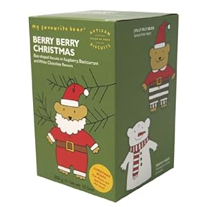
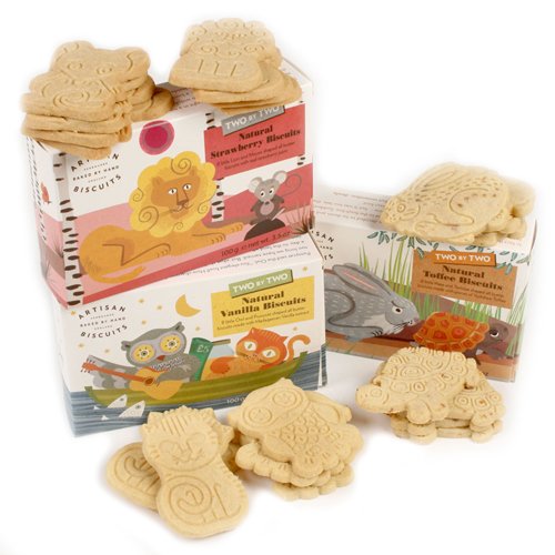
I started by looking at different styles of childrens packagaing for food and biscuits in particular paying attention to those with characters/ animals. 

Common things - bright cold colours, cartoon like characters, bold rounded lettering


Online image accessed 21st March 2013 http://www.foodepedia.co.uk/food/2008/dec/organix_nojunk.htm

Online image available from http://www.poundland.co.uk/product-range/a-z/organix-goodies-organic-animal-biscuits/


Images available online from amazon.co.uk


After some Googling I moved to my sketchbook to think about the animals I wanted to create for each of the biscuits namely Choc Chip, Raisin and Ginger. 

To me when someone mentions extinct animals the one which would immediately spring to mind would be a Dodo so I decided to incorporate this into the range. For the others I considered Golden Toads, T- Rex, Mammoths and a Quagga (an extinct Zebra). 

Sketching out ideas I was aware I wanted the animals to interact with the biscuits and considering having the biscuits being held, eaten, or played with. 

I looked at the stances of the animals and considered different view points - straight on, sideways and whether to have the whole animal in the image. I thought that based on some of the packaging currently available the animal wouldn't necessarily need to be in complete view. 

Deciding on what animal for each range was quite straightforward. The pink/ orange colours of the Dodo made me think GingerSnap, the Mammoth made me think brown/ choc chip and for some reason my Brontosaurus was destined to be purple which suited the raisins. 

Using a variety of watercolour, pencil and crayon, I coloured the images and also had a go with some hand-drawn letting ( which I later discarded!) 

I decided I wanted to convey that these were quality organic biscuits by selecting a common logo across the range. I used Photoshop to add backgrounds/ texture and added pictures of the actual biscuit which seemed appropriate to allow the customer to visualise the final offering. 


Research mood board - extinct animals


I then had the idea of illustrating directly onto some different paper almost like a sort of caveman style painting and selected some slightly crumpled brown paper. I used some chalks to create a pretty simplistic drawing then added some effects in Photoshop. I think this actually made a good alternative and the limited colour palette is different to a lot of the other biscuit offerings and may appeal to parents selecting the packaging from the shelf.

The packaging for the rest of the range I think would appeal to both parents and children and I think I've been successful at creating bold, friendly characters that work with the different biscuit types and manage to convey the luxury, organic nature of the products.


Thursday, 28 March 2013

Exercise - Text and Image

This exercise involved firstly selecting suitable fonts to suit and portray a range of words.


I then went on to trace the fonts with different colours which I thought appropriate for their meaning. Some words were harder than others but Fun conjured up bright colours like orange and red whereas blue was appropriate for Calm.

I collected different cuttings / clippings etc which I thought portrayed the meaning of the words.


There was some overlap and I particular liked some of these Mad or Fun images from an old fashion mag which shows the model dressed in almost clown like make up and costume. Other images for Mad/ Fun included the mad hatter, bright colours, squiggly patterns
Calm - blue - sea clouds peaceful.


I then decided to try and fill a few of the words in Photoshop and selected a loose serif font for Calm with a blue pebble dash calming background. For Mad I chose a Sans-serif font with a crazy black and white chequered effect and for Fun a bold and colourful pattern.


I then trying filling freehand. Bright crayons and felt tips for the word Fun . Experimentation with pattern. Strips for fast, broken lines to try and represent Slow.


Type and fonts are really of interest to me and I enjoyed thinking about the appropriateness of font selection depending on the theme being worked on. I want to continue to experiment with handmade fonts and hope to become more confident at selecting striking and appropriate fonts for various design and illustration projects.

Friday, 28 December 2012

Exercise: Children's book cover Animals from Around the World

This exercise asked us to produce a cover illustration for a childrens book cover to make children select it from the shelf. The target market is 7 - 11 year olds.
The book  "Animals from Around the World"  is a natural history book which suggests to me the book is knowledge based perhaps something like a reference or encyclopedia type book.

I began by doing some internet searches to look at different styles of illustrating animals. I considered what animals and how many would be appopriate to include on a front cover design and looked at different styles of illustration some which were almost cartoon like representations and others which were more accurate representations. I also felt that the books that were more educational seemed to have actual photographs on the front cover with text as opposed to being an actual illustration.


Bearing in mind the brief which was to make the cover modern, appealing and different from the usual offering, I experimented with different styles of illustration and with composition in my sketch book. I decided to work to an A4 size format for ease of viewing and to work portrait.

Immediately, I began to think of having a globe with animals going round it although there are numerous variations of this idea already available in different formats.

I then thought about just doing some detailed realistic illustrations of animals and arranging them around a page with text.

Other ideas from this sketchbook stage included having a sort of silhouette style outline of a lion/ animals ( I initially thought a lion as its seen as one of the major animals) and having a sunset.

Taking these ideas forward I produced illustrations in pastel for the sunset idea and watercolour/ pencils of the globe and animal ideas.

I then took my selection of works to photoshop and explored the composition further.

For my globe style illustration I thought a blue background would work to bring out the image and I kept my illustration style quite loose.

The one with the more detailed drawings I found it hard to unite the image and thought it looked a bit disjoined as I struggled to find something in the background that would bring it all together.

The silhouette image was working better but I thought that perhaps the lion on its own didn't accurately represent the book so I added in an elephant and giraffe and used photoshop to enhance the colour of my pastel drawing.


Experimenting with font positioning - think the bottom one kepts the title together.


Having produced these I wasn't entirely satisfied and remembered that from the last assignment my tutor had suggested that my style was coming through in some of the looser watercolour style drawings which I produced by just drawing with the brush. I also was thinking about some of the other illustrators I have been looking at including Jill Calder, Christopher Corr and Laura Carlin and thought perhaps some simplified representations of animals might be more modern and fit the brief.

Christopher Corr


Online image accessed 28th December 2012 Available from
http://www.illustrationweb.com/artists/ChristopherCorr/gallery/352


I produced illustrations in this style and then placed them in photoshop with no background colour and actually think they look quite strong. Although, I would be really grateful of some pointers from my tutor on the success of this sort of work.


Another idea which I wanted to have a go with was producing a more type based illustration with animals or animal print incorporated to the lettering. I produced an initial line drawing and struggled to think how best to colour this. I settled on watercolour and pencil although once I get a proper chance would like to try colouring digitally in illustrator. My initial thoughts about the colours to use were bright and bold but to avoid stereotypical colour choices for children I limited my palette as I had done in my previous mock ups using oranges, yellows and blues with some small accents of other colours.
I thought this was reasonable successful but if I was to choose a final piece I would say the looser style mock up would be my preferred choice.


Overall, this was another useful exercise at exploring different types of illustration appropriate for purpose and in considering how to compose/ unite a final cover.
I think with time and experience obviously my ability to produce a more professional piece will improve but I think that the exercise was fairly successful in sticking to the brief and coming up with some interesting ideas/ alternatives which are eye catching.