The final images will be POS display near the fruit and veg.
 The first stage asked us to create an illustration of fruit or veg - one for each range Summer and Autumn. I wasn't sure whether to go with fruit or veg so decided to experiment with both and see what I felt was working best. I began by doing some brainstorming of summer and autumn thinking about what fruit/ veg each brought to mind and also trying to create some mood boards that reflected the seasons. I did some research into what fruit and veg were in season in Summer and Autumn being sure to keep to the brief.
 At this point I also looked at different food illustrations in food mags by illustrator including Lucile Prache, Emma Dibben and Heather Gatley to name a few. I liked the loose style of Lucile but was unsure whether some of her work was too loose and more subjective rather than objective. I was aware the brief wanted the drawing to be objective and based on direct observation.
 I then went to my sketchbook and began a variety of sketches and colour studies of various fruit and veg trying out different mediums - inks, watercolour, pencils and crayon. I thought that inks or watercolour would be most suitable for the brief. I was also trying to bear in mind I wanted the fruit/veg to look edible and reflect this in the colour choice.
 A great piece of advice from my last assignment from my tutor was to mix darker tones to create shadows etc rather than use black and so far I've found this means some of my illustrations aren't as muddy looking.
At first I found it difficult to get a light touch to my paintings and I thought the fruit looked a bit flat. I tried different brush techniques and variations of washes and eventually felt I was making some progress. I've never really "properly" used watercolours or known how they work really and I read some techniques and advice which I think helped me in my experimentation.


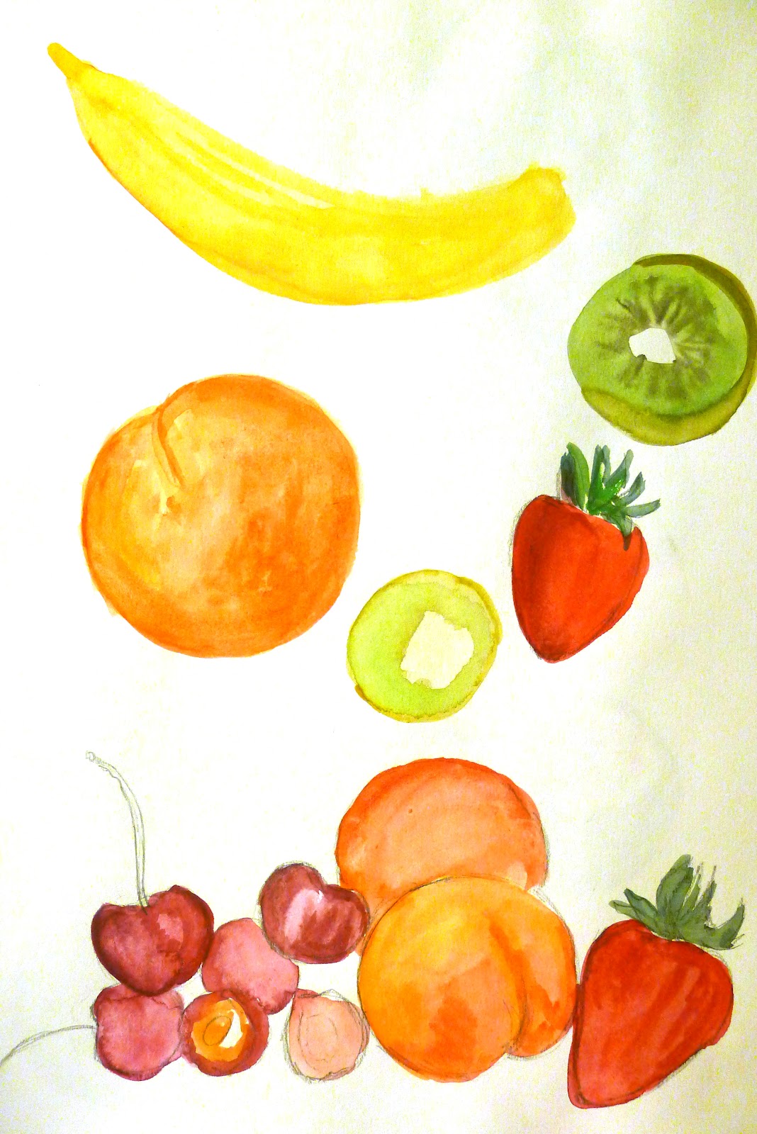


 I moved on to doing some larger illustrations incorporating some of the fruit from my sketchbook and considered what fruits best illustrated summer. I thought about doing British summer fruits peaches, strawberries etc or going down the exotic fruit line. Both could be considered seasonal summer produce. I drew fruit partially cut open and segments and was aware I wanted it to be apparent what fruit was being portrayed. I particularly liked working with colour pencil and some watercolours although thought that perhaps some of the still life compositions were a little boring and not particularly inspiring. I decided at this point to stick with fruit for summer and began to look at the autumn illustration following a similar process of sketchbook work and some larger drawings. To me the season Autumn brought to mind vegetables rather than fruit so I went with this.


With a bank of drawings for both ranges I then went back to my sketchbook for some composition ideas for the next part of the assignment which asked us to incorporate some aspects of the season to make a finished illustration for each range.
 Ideas I had included summer salads, picnic rugs, summer sundaes and drink, fruit falling into a summer sundae glass, single pieces of fruit against a coloured background, ice lollies filled with fruit, sunburst effects.
Autumn ideas - soups and stews, warm colours, incorporate reading and log fires, a drawing of a single vegetable

I experimented with some more drawings and began to do some experimentation adding backgrounds, text etc which portrayed the seasons in Photoshop (which I've just bought and am loving!) I also looked at some Summer and Autumn colour palettes to consider how best to place the fruit and make it stand out against complementary colours, yet was aware that sometimes very bright colours could look garish in a supermarket.


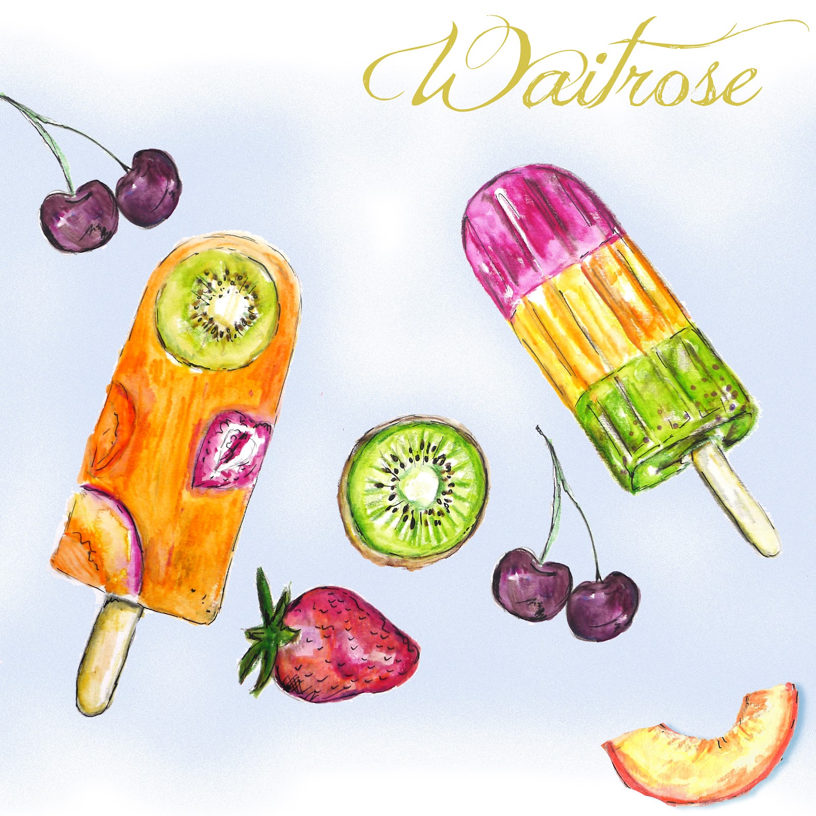


I was quite pleased with how some of these photoshop compositions came out and actually think any one would probably be suitable for the brief . I particularly liked the veg box illustration above and also quite liked the bold almost print like summer piece (although I thought that the fruit in this one wasn't as clear/detailed). I settled on the two images below as being my final pieces. Both represent the seasons Summer and Autumn respectively and I could see them in a supermarket such as Waitrose.
I've tried to pick colour, font etc which represents the season and think my drawings are pretty realistic and I'm quite pleased with the final outcome. I think this was a good exercise for me to look at my drawing and painting style and was a good learning process. I want to continue to look at the tonal qualities of my painting and using different gradiations of colours to build up depth.