Showing posts with label Research. Show all posts

Monday, 24 December 2012

Researching illustrators - Laura Carlin & Tom Gauld

After the last assignment I received some feedback from my tutor who thought that some of my true style was coming through in some of the pieces I produced by drawing direct with my paintbrush. She suggested I look at the work of Laura Carlin. Laura graduated with her MA from the Royal College of Art in 2004, and has built up an enviable client list including The New York Times, The Guardian, American Express and British Airways and has won numerous awards.

Laura uses traditional media without any digital enhancements. Her work to me has a naivety to it and almost looks sketchbook like. She tackles difficult subjects in her works for various editorials often around difficult subjects.


Online images Available from http://www.heartagency.com/artist/LauraCarlin/gallery/4, Accessed 24th December 2012.

Recently she won for her illustrations of the Iron Man by Ted Hughes. Here she uses very bold almost distorted figures and shapes to bring the story to life.


I particularly like the colour choice and think the plain backdrops work well with the illustrations making them the focal point.

I especially love her animals on ceramics, and the textures that she creates on paper with translucent paint and rough paper.

Similarities can also be seen in the work of Tom Gauld. His illustrations often convey complex ideas in very simple but effective drawings. His works tend to be more comic/ cartoon based but I really like the humour and metaphors in his work.


Online Image Available from http://www.tomgauld.com/index.php?/portfolio/ghosts/ Accessed 24st December 2012


Online Image Available from http://www.tomgauld.com/index.php?/portfolio/boots/ Accessed 24st December 2012


Monday, 8 October 2012

Researching illustrators - Christopher Corr

I had some positive feedback from my second assigment and I asked my tutor a lot of questions about different illustration styles and what makes a successful illustration. I think at the moment I'm looking at so many different styles and wondering what style to adopt overall and for each of the exercises. However, my tutor reassured me at this stage of my studies that isn't necessary but I should just concentrate on developing my skills and trying out different things.

I asked about more abstract/ almost childlike illustrations and what makes them good as opposed to just being a piece with less technical accuracy.
I'm starting to answer these myself but thoughts I'm having
- the context in which the illustration is produced/ intended purpose - does it fit the context/ brief - all determine how successful/ appropriate the illustration is.
-  a lot of simpler illustrations have other elements which draw the viewer into the image - simple shapes, or colour combinations, engaging / emphasised elements eg emphasising the main element of a subject.

I looked at the work of Christopher Corr as per my tutors suggestion. His work is bold with strong colour combinations. Christopher's inspirations come from travel and he works on a lot of childrens book covers.
At first I wasn't so sure about his work as I wasn't overly keen on the abstracted/ simplfied people that feature in a lot of his work. However looking at his work more closely in the context he produces the illustrations I think they're actually really successful in converying ideas and drawing attention. The colour choices whilst bold aren't garish and I can imagine they would attract children to the book covers he works on. As a lot of his work revolves around people and travel I think his work really represents the culture of the people in terms of how the figures look and the colour choice. His figures are instantly recognisable as being his work yet they all do seem to represent people of different cultures.


Online Images - Illustration Web, Available from http://www.illustrationweb.com/artists/ChristopherCorr/view; Accessed 7th October 2012

Wednesday, 26 September 2012

Other artists - Kate Miller illustration


After completing the last exercise I came across the work of Kate Miller and thought that my final image "Explorer" had elements of this sort of style (although Kate's is a lot more refined)


Kate's illustration originates from a screen-printing background and although now working digitally the processes of layering sketches, photographs and found objects remain constant. Kate is based in Edinburgh and her work has been used widely throughout the design, editorial and advertising sectors.
I really like the use of colour in her work and the montage effects she creates using a variety of mediums and think its clever how she has a lot going on in each image yet its not over complex or worked.  She also has a very distinctive style and her work is clearly identifiable as all her images seem to have common features of hand drawn, photographs and bright colour schemes. Thinking about finding my own personal style of illustrating is something I hope to work on and I can already seem areas where my work is stronger than others and identify mediums I prefer working in/ with.

online images Available from http://www.centralillustration.com/artists/Kate-Miller/ [30th October 2012]

Tuesday, 31 July 2012

Researching the work of others

I came across the work of Minna Havas and instantly loved the photorealistic qualities to her work and her colouring methods. I really want to develop my drawing and painting skills and would love to be able to recreate something as realistic as the works she produces.

I found her bio really interesting to read. Source from here

Minni Havas (b. 1983) is a freelance illustrator based in Helsinki. Having studied fashion design at the University of Art and Design Helsinki, her focus is mainly on fashion illustration. Minni uses colour pencils to draw detailed pictures with magical colours and arrangements somewhere in the borderlands of the real and the imaginary.


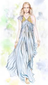
Known for her photorealistic drawings of girls, Minni grew up admiring her dad’s airbrush art collection and reading cartoons such as Roger Leloup’s Yoko Tsuno. “What a beautiful character,“ she says. “I love the way Leloup draws a human face.” As a child, Minni started imitating Leloup’s characters as well as drawing people from books and magazines together with her sister Milja – the dark-haired girl who often appears in Minni’s drawings today. Already then, she found herself getting into details and drawing “in the right way”, jealous of the sister who wasn’t that strict. “I’m so particular about things,” she says. “Things need to follow a certain order.”  
The way Minni talks about things like the shades of red and blue under human skin, the movement of materials in an image, or hard and soft colour pencils, demonstrates the fact that her work is as much about the (often very dogmatic) process as the end result. The way of Minni’s working is very technical and quite slow. At the moment, she works with collages of photographs. “I take a hand from one image, a face from another, and the hair from somewhere else,” she explains. In the future, her dream is to get a photographer, and maybe also a stylist, to work with.

When Minni draws, she doesn’t take up too much space but needs a lot of natural light. She always draws by the window. In addition to water solvent colour pencils of different strengths, her drawing equipment includes a rubber of which she cuts out little pieces with a surgeon’s knife, an automatic sharpener she got as a Christmas present from her boyfriend, a set of small brushes for the most detailed lines as well as a small vacuum cleaner for cleaning the dust coming out of the pencils (if she didn’t clean the dust, even a small drop of water on it might destroy the drawing). In the end, she uses a scanner and later Photoshop only to make the drawings look like they were on paper again. Trying to use the computer as little as possible, Minni aims to maintain a sensation of authenticity in her work – the childlike feeling of ‘wow, someone actually drew that by hand’.

“I’m intrigued by the possibilities of drawing,” Minni says. “I can draw things from my head that would be impossible to photograph.” On the other hand, she gets very inspired by interesting looking models and the challenges of simulating reality – especially certain body parts. Minni’s favourite one is the mouth, which is also the hardest one to draw. Drawing bare skin takes the most of her time. “In addition to volume, it contains a lot of detail,” she explains. “Skin also takes up a lot of brown colour, which is the colour pencil that always runs out first.”

Lately, Minni has been working on illustrations for magazines as well as drawings for projects such as advertising campaigns or a series of stamps for the Finnish mail. She is also starting up a clothing collection with her friend Anne in order to expand her work into three dimensions. “The clothing collection will compliment my very detailed working with the illustrations,” Minni explains. “When it comes to fashion design, Anne is the more technical one of us two.” Like this project, Minni is open for contrast and multidisciplinary challenges in commissions to come – and dreaming of making a big fashion editorial for one of her favourite magazines together with her in-house photographer and stylist to be.

Bio by Jenna / OK Do

Sunday, 22 July 2012

Researching fashion illustrators

I've received my feedback from my first assignment and my tutor has suggested some fashion illustrators whose work I should have a look at, which might help me to develop my illustrations. David Downton's work is predominately fashion based and I really like how he captures the main elements of the person yet with relatively limited detail.

I've read up on this work and a few interviews he has given and he states that the most important thing in fashion illustration for him is the sense of the body in the clothes. After that, proportion, colour, and detail. He also states that he tries to capture a sense of the moment and use strong drawings. Anything can catch the eye - but what is interesting in fashion terms isn't necessarily what makes a good drawing and vice versa.
To eliminate the detail in his work he says he does lots of drawings on layout paper then starts to deconstuct parts until it looks spontaneous.
David use watercolour or gouache for small scale pieces and if he needs flat saturated colour uses cut paper collage and then applies line using an acetate overlay and also works on pure line drawings with Indian inks. David has illustrated a lot of famous woman and I'm going to try doing some images from fashion mags to try experiment and develop my techniques. Hopefully, this will help me with some of my figure drawing skills. I also want to have a look at the work of Rene Gruau, Marcel Vertes and Rene Bouche who David highlighted as very influential successful fashion illustrators.
Having a quick research I particular want to look at Rene's work as he seems to have done a lot of portraits, sketches and very famous illustrations for Vogue and I love the fluidity of his work.


In contrast, the illustrations of Tanya Lang are almost abstract yet do have a similar sense of movement about her work. She uses mixed media in a lot of her work and to me her illustrations and figures are distorted yet still manage to create a sense of the characters being glamourous. For me she seems to distrort proportions of the figures yet they seem to really work. I think this is a real talent to do this and and does make my question what makes something work when the drawing / illustration isn't technically correct. I guess in some instances this is appropriate and it depends on the context.