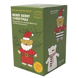
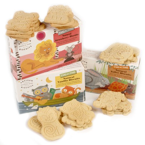
I started by looking at different styles of childrens packagaing for food and biscuits in particular paying attention to those with characters/ animals.
Common things - bright cold colours, cartoon like characters, bold rounded lettering
Online image accessed 21st March 2013 http://www.foodepedia.co.uk/food/2008/dec/organix_nojunk.htm
Online image available from http://www.poundland.co.uk/product-range/a-z/organix-goodies-organic-animal-biscuits/


Images available online from amazon.co.uk
After some Googling I moved to my sketchbook to think about the animals I wanted to create for each of the biscuits namely Choc Chip, Raisin and Ginger.
To me when someone mentions extinct animals the one which would immediately spring to mind would be a Dodo so I decided to incorporate this into the range. For the others I considered Golden Toads, T- Rex, Mammoths and a Quagga (an extinct Zebra).
Sketching out ideas I was aware I wanted the animals to interact with the biscuits and considering having the biscuits being held, eaten, or played with.
I looked at the stances of the animals and considered different view points - straight on, sideways and whether to have the whole animal in the image. I thought that based on some of the packaging currently available the animal wouldn't necessarily need to be in complete view.
Deciding on what animal for each range was quite straightforward. The pink/ orange colours of the Dodo made me think GingerSnap, the Mammoth made me think brown/ choc chip and for some reason my Brontosaurus was destined to be purple which suited the raisins.
Using a variety of watercolour, pencil and crayon, I coloured the images and also had a go with some hand-drawn letting ( which I later discarded!)
I decided I wanted to convey that these were quality organic biscuits by selecting a common logo across the range. I used Photoshop to add backgrounds/ texture and added pictures of the actual biscuit which seemed appropriate to allow the customer to visualise the final offering.

 |
| Research mood board - extinct animals |
I then had the idea of illustrating directly onto some different paper almost like a sort of caveman style painting and selected some slightly crumpled brown paper. I used some chalks to create a pretty simplistic drawing then added some effects in Photoshop. I think this actually made a good alternative and the limited colour palette is different to a lot of the other biscuit offerings and may appeal to parents selecting the packaging from the shelf.
The packaging for the rest of the range I think would appeal to both parents and children and I think I've been successful at creating bold, friendly characters that work with the different biscuit types and manage to convey the luxury, organic nature of the products.


No comments:
Post a Comment