I started this exercise as per other ones by looking at examples of other musuem posters to get a feel for styles content etc.
I then visited a few museums taking my camera to document interesting exhibits / pieces which I thought could feature in my posters. I visited the national museum in Edinburgh and the Kelvingrove Art Gallery in Glasgow.


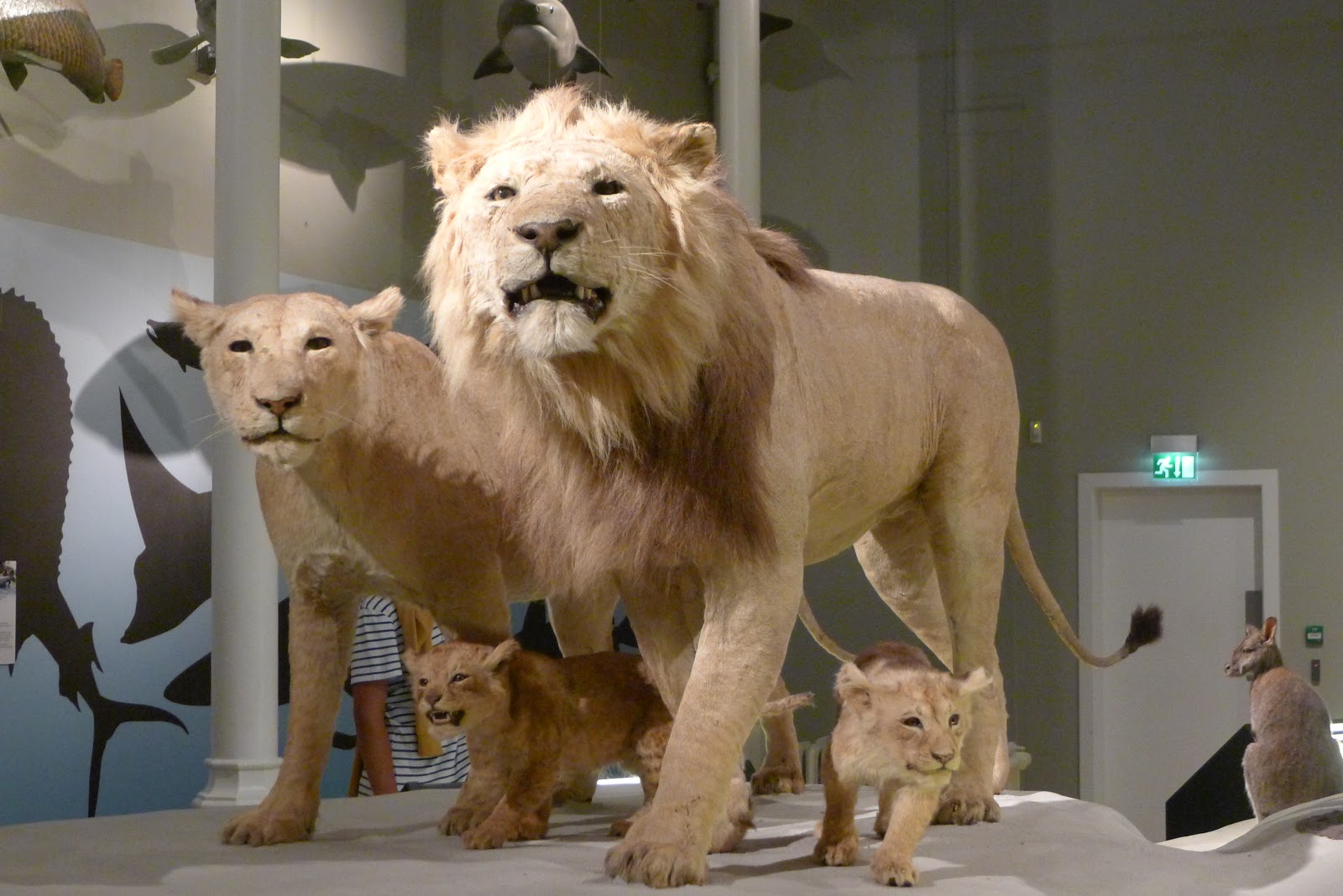


From my photographs I produced some sketchbook brainstorming style ideas thinking about what exhibits would make interesting, appealing posters for each of the groups.


Looking at other museum poster styles - bright colours, simple strong shapes.


Considering how to illustrate exhibits - watercolour , shape outlines, different angles


Starting with the youngest age range I thought that something large and attention grabbing is usually pretty appealing to young children who can be easily distracted. From my visit to the musuem I noticed that Sir Roger the Indian Elephant received a lot of attention from young children. I considered different view points - straight on, full size drawing or perhaps taking the elephant and having sections of it on the posters asking the kids to guess what sort of animal they'd see (however I decided this was getting too complex).
I then considered adding characters and having kids looking up at the elephant showing the scale of the exhibit in comparison to the children. I produced some paintings of the elephant from different view points trying to show the texture and tonal qualities of the exhibit and kept the colours representative of the actual elephant. I added some characters and came up with idea of having a strapline which could link all the posters - "Who will you meet?". I also decided that a common museum logo would unite all posters in my range and selected some bold text to create a text logo. I quite liked some of my ideas but started to experiment in photoshop and thought perhaps a simpler representation of the elephant might be more appopriate for the young age group. I did some simple cut outs of the elephant exhibit shape and after photoshop experimentation with shadows and colours came up with something which I think looked quite eye catching and appropriate which just had the elephants face as the main focus. Colour scheme wise I initially was thinking young kids, bright colours to grab attention, but trying to avoid being stereotypical thought that by having a limited colour scheme yet still with some bright colours it might do the job. I also considered having a bright elephant but to me it didn't look right.


Next the middle teenage age range. There's a hanging wooden exhibit of glasses showing very bold eyes which I thought might be appropriate for teenagers who are always very image conscious! I thought that perhaps just having a simple drawing of these with some text would be effective and I kept a similar theme to the previous poster with logo and slightly altered the strapline to "Who will you see".

For the general audience poster I focused on one of the major talking point exhibits in the gallery namely the hanging heads (which consists of lots of heads with various expressions suspended from the gallery ceiling)
I think these look almost eerie but are quite something to see and think they do appeal to a general audience.
I produced some pencil sketches and watercolour versions selecting interesting heads to draw.
I considered whether to just have one head in the poster or mulitple but thought that multiple gave a better impression of the exhibit. Colour scheme wise I wanted to make the heads almost ghost like/ scary and after experimenting with different colour schemes thought that a black and white with yellow text was most appealing.
Overall, I think the posters are relatively successful in that they all look like they could come from the same place yet are suitable and targeted to the individual audiences. I resisted the temptation to over complicate images and go overboard in experimentation with Photoshop using filters etc to create interesting effects as I'm certainly learning that simple can be most effective unless you are highly skilled using Photoshop.


No comments:
Post a Comment