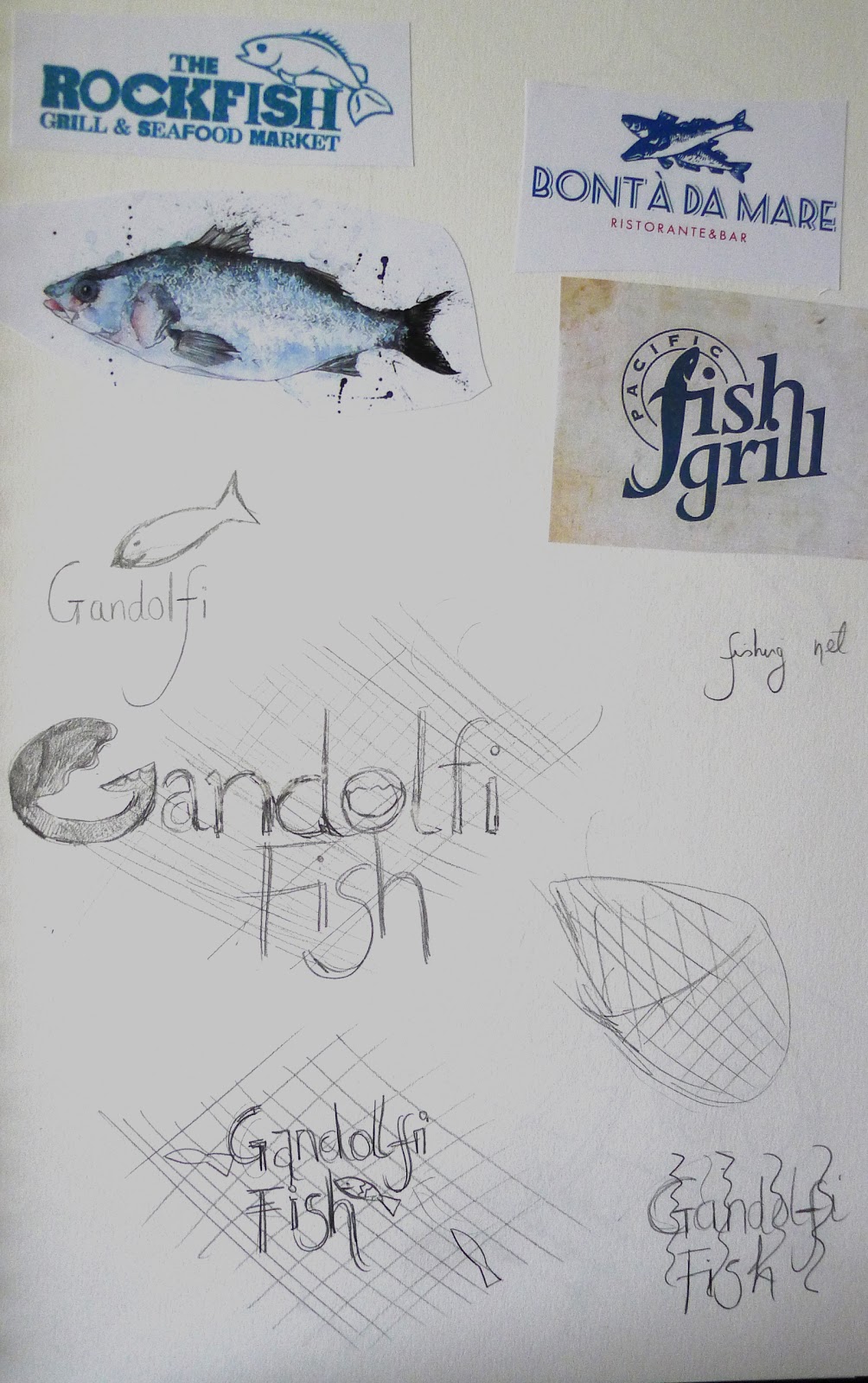
I began by looking at various other styles of logos for fish restaurants and found that a lot of styles incorporate a fish design / emblem of some sort sometimes in with the text and often colours are kept to a minimum.
Food illustration is something which interests me and I really like the style of Emma Dibben and know she has produced some watercolour images of fish etc which are used as part of a Waitrose campaign. I considered producing some sketches in this style but thought that for this exercise something perhaps simpler and less detailed would be more appopriate and would stand out.
I played with some ideas in my sketchbook considering various shapes of fish / fish related things including fishing nets, waves etc.
At this point I remembered about one of the famous Glasgow based fish restaurants - Gandolfi Fish and I thought that trying to imagine the logo / illustration being for them would help me in my ideas. I considered incorporating the name of the restaurant to the design and echoing the "G" of the cafe with the shape of the fish/ shrimps. I quite liked some of these and came up with a few alternatives.


 |
| like the idea but think it needs to be more than just a watercolour illustration |


This one looks more suitable for a fish and chip shop and doesn't look as high quality.

The shrimp/prawn was most appealing for me in terms of design but I didn't think that the watercolour alone was particularly strong or stood out. I then thought about trying to create a sort of relief/ print effect with limited colours and generated some ideas using photoshop - using invert and experimenting with filters.


 |
| Colour variation |

 |
| Final illustration |
I used a blue shade to reinforce the fresh sea appeal and think that the logo works well at different sizes including the specified size 4 x 4 cm for the menu.
I produced a mock- up to see how it would look on a menu and think that it works fairly successfully as a logo illustration.
I quite enjoyed this exercise and its made me really look at logo and sign design and whether something is successful to attract attention and fit for purpose.
No comments:
Post a Comment