I must admit I wasn't entirely sure what I was doing at this point but just set about going with the flow of the music and trying to represent the different elements.
I experimented with inks and tried letting them run into each other and tried spreading them out with a pen and letting it run.
I quite liked some of these effects but wasn't sure if I was totally following the brief and getting a true representation of what the music meant to me. I then worked on a large sheet and made some more marks , selecting different combinations of materials and colours which I felt represented the tonal qualities of the music. The marks I made were flowing and spirally at times as the music dipped and then would gather momentum.
.
I then decided to try work on these with Photoshop and playing with filters and colour variations and I managed to create some interesting combinations.
We then could add in form to our image and I had the idea to try and make a representational shape of Beethoven and have it showing through the marks. I used Layer masks to create some interesting effects and used the shape outline from a photograph of Beethoven.
I quite liked some of these effects but got to thinking about what my tutor had advised and based on things I'm reading/ learning that sometimes less is more and I wasn't sure if these looked overworked.
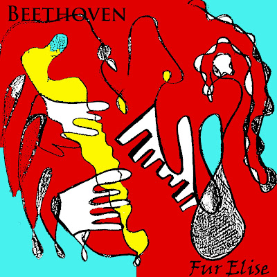
I tried to consider could this by used for a CD cover type illustration as I worked.
I then scanned my drawings and did some colour adjustments with Photoshop and added some text to see how well it would potentially work if it was used as a CD cover.
I liked these images a lot better and think they're stronger than some of the earlier colour / texture pieces.
This was a useful exercise at practising my Photoshop techniques but also made me hone in my experimentation and stick to something slightly simpler which I think was more effective.
I've just had my feedback from my 2nd assignment and might try some more alternative colour palettes and experimented with some different colour palettes.


No comments:
Post a Comment