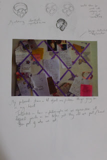
I began this task in my sketchbook with some spider diagrams thinking about everything which represents me. I came up with quite a variety of things, some of which were quite cheery and positive and others which represent some of my troubles and were perhaps something which I wouldn’t want to share with everyone.
To get across a representation of me in a single combined image I knew that there would probably be multiple elements to the illustration as a single image of say perhaps me wouldn’t really communicate a lot about myself.
 |
| Sketchbook idea generation - snapshot of me |
I also remembered about a picture I took on holiday in Vegas last year of myself reflected in the glass doors. In the image the camera is clearly visible and as images and photography are something I’m really interested in I thought I’d like to include this. I also liked the idea that the illustration was going to be a snapshot of me!
 |
| Sketchbook ideas - a reflection of me |
I have various photographs of myself over the years and was thinking about how we all change and develop throughout our lifes but these snapshots all make up who we are today. Trying to communicate this in an image seemed pretty complex yet I wanted to show how there are different sides of me.
I decided to try draw some images of myself from the past and from more recent times. This included a drawing of myself from a photograph as a child which is a lovely image as I look so angelic and content, yet also some images which show me as unwell. I used colour and watercolour paint for the happier images and black and white pencil drawings for some others. Both of these are mediums I enjoy working in.
I also did some illustrations of things I like – some Pepsi Max, a mug of tea, my notebook , novel and pen and some lace.
 |
| sketchbook ideas |
 |
| image of self |
 |
| child image of self |
 |
| idea of image overlay on pinboard |
 |
| image of me - charcoal and pencil |
At this point with a bank of illustrations, I must admit I was a bit unsure what direction to take and how to put it all together as a composition/finished illustration. I sketched out some ideas and decided that I wanted to put it all together in Photoshop Elements as I know I want to learn more about working digitally and enjoy experimenting.
After some experimentation I played about with having an outline or image of me surrounded by snapshots and things that make up who I am. I played about with different background combinations – adding some scanned lace (as I love Victorian yet modern inspired clothes!) I also considered adding some text but thought it looked a little lost and didn’t add a lot to the illustrations. I couldn’t quite get something I was happy with so took a step back and re – read the brief. The brief said the work could show your hopes and aspirations for the course. This got me thinking about how ideally I’d love to work in a more creative job, how I’d like to be healthy (like some of the images I’d drew already rather than how I have been of late).
 |
| Image of lady from fashion mag I painted |
The final image was okay but the style of drawing I produced seemed quite tight and a bit too stylised (which is a style I think I’d like to get away from). However, I did think perhaps this could feature somewhere in my final work.
With this in mind I then set up the camera and took a picture of me at my desk and produced a pencil drawing with tonal elements which I preferred.
 |
| image of me at desk - like lifestyle mag - who I want to be - working creatively wasn't keen on style of image |
 |
| image of me sketched from photo I took |
Taking this to Photoshop, I thought about then combining my previous idea and having my pinboard in the background with different snapshots of me. I tried some different background combinations, experimenting with layout and colour and came up with something I liked better.
However, by doing this I came upon a better composition for my previous idea of just having a pin board so I went back to an earlier version and made some adaptions.
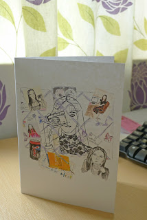
As a result I came up with two final works, both of which I think would represent me and communicate something about me to my tutor. However, I settled on the one which I thougth was stronger and will now send it off to my tutor. However, by doing this I came upon a better composition for my previous idea of just having a pin board so I went back to an earlier version and made some adaptions.
 |
| Final image |
I had lots of ideas for this exercise but getting across these in an illustration was quite hard. I found it really helpful to keep all ideas in my sketchbook even if I was unsure how to execute them.
I think my main issues at this stage are decided on the style of illustrations appropriate/ that I want to create – whether that be something more detailed or more stylised. I think that both final outcomes show this as they combine some more detailed pictures I drew and some more stylised ideas.
I really enjoyed working with Photoshop and think there are lots of things I’ll be able to learn and explore, using layers and backgrounds to bring together illustrations and enhance my drawings.
I know that composition is something which I need to work on and I hope that as the course and my confidence develops I can learn more about what works as a finished piece.
Throughout the exercise and the course to date I think it’s important for me to look at images, photographs, magazines etc for composition ideas and general inspiration! After reading some articles about illustrators I’ve also began to think that it’s okay for me to want to draw from source images at times or use reference material as we all do it and that I should stop doubting myself because of it.


No comments:
Post a Comment