The first one is of some good friends - I tried using coloured pencils as per Minna Havas. I think it works to an extent although is by no means anywhere near as realistic as the work of Minna.
A personal journal blog created to show my learning progress on the OCA illustration course. I'm inspired and overwhelmed by art, fashion, style, food, nature and the Internet! Laura x
Tuesday, 31 July 2012
Drawing and painting practise
I'm very keen to develop my drawing and painting skills and would especially like to work on different ways of portraying people. I loved the work of Minna Havas - see previous post and want to try both making my figures more realistic and also being more abstract. I've posted below some illustrations I've produced.
The first one is of some good friends - I tried using coloured pencils as per Minna Havas. I think it works to an extent although is by no means anywhere near as realistic as the work of Minna.
The first one is of some good friends - I tried using coloured pencils as per Minna Havas. I think it works to an extent although is by no means anywhere near as realistic as the work of Minna.
Researching the work of others
I came across the work of Minna Havas and instantly loved the photorealistic qualities to her work and her colouring methods. I really want to develop my drawing and painting skills and would love to be able to recreate something as realistic as the works she produces.
I found her bio really interesting to read. Source from here
Minni Havas (b. 1983) is a freelance illustrator based in Helsinki. Having studied fashion design at the University of Art and Design Helsinki, her focus is mainly on fashion illustration. Minni uses colour pencils to draw detailed pictures with magical colours and arrangements somewhere in the borderlands of the real and the imaginary.


Known for her photorealistic drawings of girls, Minni grew up admiring her dad’s airbrush art collection and reading cartoons such as Roger Leloup’s Yoko Tsuno. “What a beautiful character,“ she says. “I love the way Leloup draws a human face.” As a child, Minni started imitating Leloup’s characters as well as drawing people from books and magazines together with her sister Milja – the dark-haired girl who often appears in Minni’s drawings today. Already then, she found herself getting into details and drawing “in the right way”, jealous of the sister who wasn’t that strict. “I’m so particular about things,” she says. “Things need to follow a certain order.”
The way Minni talks about things like the shades of red and blue under human skin, the movement of materials in an image, or hard and soft colour pencils, demonstrates the fact that her work is as much about the (often very dogmatic) process as the end result. The way of Minni’s working is very technical and quite slow. At the moment, she works with collages of photographs. “I take a hand from one image, a face from another, and the hair from somewhere else,” she explains. In the future, her dream is to get a photographer, and maybe also a stylist, to work with.
When Minni draws, she doesn’t take up too much space but needs a lot of natural light. She always draws by the window. In addition to water solvent colour pencils of different strengths, her drawing equipment includes a rubber of which she cuts out little pieces with a surgeon’s knife, an automatic sharpener she got as a Christmas present from her boyfriend, a set of small brushes for the most detailed lines as well as a small vacuum cleaner for cleaning the dust coming out of the pencils (if she didn’t clean the dust, even a small drop of water on it might destroy the drawing). In the end, she uses a scanner and later Photoshop only to make the drawings look like they were on paper again. Trying to use the computer as little as possible, Minni aims to maintain a sensation of authenticity in her work – the childlike feeling of ‘wow, someone actually drew that by hand’.
“I’m intrigued by the possibilities of drawing,” Minni says. “I can draw things from my head that would be impossible to photograph.” On the other hand, she gets very inspired by interesting looking models and the challenges of simulating reality – especially certain body parts. Minni’s favourite one is the mouth, which is also the hardest one to draw. Drawing bare skin takes the most of her time. “In addition to volume, it contains a lot of detail,” she explains. “Skin also takes up a lot of brown colour, which is the colour pencil that always runs out first.”
Lately, Minni has been working on illustrations for magazines as well as drawings for projects such as advertising campaigns or a series of stamps for the Finnish mail. She is also starting up a clothing collection with her friend Anne in order to expand her work into three dimensions. “The clothing collection will compliment my very detailed working with the illustrations,” Minni explains. “When it comes to fashion design, Anne is the more technical one of us two.” Like this project, Minni is open for contrast and multidisciplinary challenges in commissions to come – and dreaming of making a big fashion editorial for one of her favourite magazines together with her in-house photographer and stylist to be.
Bio by Jenna / OK Do
I found her bio really interesting to read. Source from here
Minni Havas (b. 1983) is a freelance illustrator based in Helsinki. Having studied fashion design at the University of Art and Design Helsinki, her focus is mainly on fashion illustration. Minni uses colour pencils to draw detailed pictures with magical colours and arrangements somewhere in the borderlands of the real and the imaginary.
Known for her photorealistic drawings of girls, Minni grew up admiring her dad’s airbrush art collection and reading cartoons such as Roger Leloup’s Yoko Tsuno. “What a beautiful character,“ she says. “I love the way Leloup draws a human face.” As a child, Minni started imitating Leloup’s characters as well as drawing people from books and magazines together with her sister Milja – the dark-haired girl who often appears in Minni’s drawings today. Already then, she found herself getting into details and drawing “in the right way”, jealous of the sister who wasn’t that strict. “I’m so particular about things,” she says. “Things need to follow a certain order.”
The way Minni talks about things like the shades of red and blue under human skin, the movement of materials in an image, or hard and soft colour pencils, demonstrates the fact that her work is as much about the (often very dogmatic) process as the end result. The way of Minni’s working is very technical and quite slow. At the moment, she works with collages of photographs. “I take a hand from one image, a face from another, and the hair from somewhere else,” she explains. In the future, her dream is to get a photographer, and maybe also a stylist, to work with.
When Minni draws, she doesn’t take up too much space but needs a lot of natural light. She always draws by the window. In addition to water solvent colour pencils of different strengths, her drawing equipment includes a rubber of which she cuts out little pieces with a surgeon’s knife, an automatic sharpener she got as a Christmas present from her boyfriend, a set of small brushes for the most detailed lines as well as a small vacuum cleaner for cleaning the dust coming out of the pencils (if she didn’t clean the dust, even a small drop of water on it might destroy the drawing). In the end, she uses a scanner and later Photoshop only to make the drawings look like they were on paper again. Trying to use the computer as little as possible, Minni aims to maintain a sensation of authenticity in her work – the childlike feeling of ‘wow, someone actually drew that by hand’.
“I’m intrigued by the possibilities of drawing,” Minni says. “I can draw things from my head that would be impossible to photograph.” On the other hand, she gets very inspired by interesting looking models and the challenges of simulating reality – especially certain body parts. Minni’s favourite one is the mouth, which is also the hardest one to draw. Drawing bare skin takes the most of her time. “In addition to volume, it contains a lot of detail,” she explains. “Skin also takes up a lot of brown colour, which is the colour pencil that always runs out first.”
Lately, Minni has been working on illustrations for magazines as well as drawings for projects such as advertising campaigns or a series of stamps for the Finnish mail. She is also starting up a clothing collection with her friend Anne in order to expand her work into three dimensions. “The clothing collection will compliment my very detailed working with the illustrations,” Minni explains. “When it comes to fashion design, Anne is the more technical one of us two.” Like this project, Minni is open for contrast and multidisciplinary challenges in commissions to come – and dreaming of making a big fashion editorial for one of her favourite magazines together with her in-house photographer and stylist to be.
Bio by Jenna / OK Do
Sunday, 29 July 2012
Exercise 11 - Black and white
For this exercise we were asked to create a linear illustration from one of the words stated. I choose "building" mainly because I want to work at drawing/ recreating scenes.
After some sketchbook brainstorming I took some pictures and did some quick sketchbook work at different building scenes around buildings in Madeira (where I was on holiday at the time!)
I then narrowed this down and produced two illustrations on A3, one based on a church and the other around an integrate door frame. (I really like ornate detail and architecture). I kept the outlines fairly simplistic based on the instructions in the brief.
I inverted both images using photoshop.
The next part of the exercise involved producing copies of the image and cutting and filling areas of white with black. It took me a while to get to grips with this and I began with my door frame image. I think this was quite difficult given the level of detail and line in my drawing which made it more difficult to cut out shapes but i kept standing back and tried to create a cooherent image with the b&w being used to almost create interest, contrast between shadow and a pattern of sorts.
 |
| cut version with black in backdrop |
Not being totally satisfied with my image I decided to work on my church image and was more selective with my choice of shape and contrast. At one point I was unsure whether to go further and add shapes of black to the background, so I took some pictures with the areas tacked down and decided it looked better without.
I decided to try bigger areas of black and white shapes and contrast digitally in photoshop and found some of the results quite effective.
See below
Artists who I would consider who produce very "graphic" images would include the work of Banksy and those of an illustrator called Rohan Daniel Eason.
I particularly like Rohan's black and white images which have a sort of dreamlike eerie quality to them, despite sometimes depicting quite childlike scenes. I really like the level of detail in his work and find them very striking.
Sunday, 22 July 2012
Researching fashion illustrators
I've received my feedback from my first assignment and my tutor has suggested some fashion illustrators whose work I should have a look at, which might help me to develop my illustrations. David Downton's work is predominately fashion based and I really like how he captures the main elements of the person yet with relatively limited detail.
I've read up on this work and a few interviews he has given and he states that the most important thing in fashion illustration for him is the sense of the body in the clothes. After that, proportion, colour, and detail. He also states that he tries to capture a sense of the moment and use strong drawings. Anything can catch the eye - but what is interesting in fashion terms isn't necessarily what makes a good drawing and vice versa.
To eliminate the detail in his work he says he does lots of drawings on layout paper then starts to deconstuct parts until it looks spontaneous.

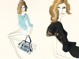
To eliminate the detail in his work he says he does lots of drawings on layout paper then starts to deconstuct parts until it looks spontaneous.
David use watercolour or gouache for small scale pieces and if he needs flat saturated colour uses cut paper collage and then applies line using an acetate overlay and also works on pure line drawings with Indian inks. David has illustrated a lot of famous woman and I'm going to try doing some images from fashion mags to try experiment and develop my techniques. Hopefully, this will help me with some of my figure drawing skills. I also want to have a look at the work of Rene Gruau, Marcel Vertes and Rene Bouche who David highlighted as very influential successful fashion illustrators.
Having a quick research I particular want to look at Rene's work as he seems to have done a lot of portraits, sketches and very famous illustrations for Vogue and I love the fluidity of his work.
In contrast, the illustrations of Tanya Lang are almost abstract yet do have a similar sense of movement about her work. She uses mixed media in a lot of her work and to me her illustrations and figures are distorted yet still manage to create a sense of the characters being glamourous. For me she seems to distrort proportions of the figures yet they seem to really work. I think this is a real talent to do this and and does make my question what makes something work when the drawing / illustration isn't technically correct. I guess in some instances this is appropriate and it depends on the context.
Friday, 20 July 2012
Exercise 10 - A subjective drawing
The object I chose to base my subjective drawing around was a bag. I decided to try this out with both my leather bag and a shopper bag. The brief said to not think about what the purpose of the object was but to think about what adjective describes the item. The words which I chose after some brainstorming were "vintage" and "waterproof" for the leather bag and shopper bag respectively.
I created mood boards for both words see below.
I then created linear drawings of both items and using ideas from my boards I then set about the task of filling my drawing.
The waterproof board had images of rain, pieces of plastic, bubble wrap, splashes etc and the vintage bag had vintage lace, fabric, old style postcards, feathers etc and other vintage inspired memorabilia.
For the shopper I had the idea that I'd like it to look waterproof and have plastic on it - ideas included using rubber gloves but then I remembered about plastic sort of shopper like bags of my childhood which contained various liquid fillings. I set about recreating this by filling a plastic insert with blue liquid in the form of washing up liquid ( this was a messy task) then sealed this with duck tape. and stuck it over the bag outline. I filled the rest of the shape with pieces of plastic bag. I printed my linear drawing on glossy paper to reinforce the waterproof theme.
For the leather vintage bag I tried to fill this in both photoshop and by hand using vintage notepaper, butterfly stamps, old textured paper and added some vintage lettering. I also decided to print this on parchment paper and created a vintage effect by tea staining a piece of paper then leaving it to dry and then putting it through the printer. I also tried adding a vintage backdrop to the image.
Overall, I was quite pleased wtih the results and am going to ask my tutor for some feedback. There are lots more possibilities to explore these technqiues in the future filling linear shapes with various textures etc especially by using layers and photoshop ( which I've now ordered and look forward to trying!)
Update - September 2012 - Just as I was looking out my work again to send to my tutor I discovered my shopper illustration image had lived up to its waterproof name (not !) and burst out over my other drawings. The effect did give it a water like quality but I didn't want to risk sending it to my tutor for fear of it leaking further!
 |
| Waterproof moodboard - colours - blue, water, plastic etc |
 |
| Vintage moodboard - pale pastels, lace, flowers, postcards, pictures |
 |
| Shopper outline |
 |
| Vintage outline |
 |
| Vintage filled with old paper, lace and ribbon |
 |
| Vintage filled with petals and stamps on tea stained paper |
 |
| Shopper filled with blue liquid and plastic bag on glossy paper |
 |
| Vintage with old paper, lace, stamps in photoshop elements
|
Exercise 9 - An objective drawing
I decided I wanted to try a few objective drawings. I choose to draw my brogues, my much loved Kurt Geiger shoes and my umbrella. Shoes are something I find quite difficult to draw but I think the images have worked quite well and are fairly accurate. The umbrella was harder given that I was drawing it lying down. I shaded the items with cross hatching and pen lines to show the tone. I think sometimes a simple image can be really effective and using simple pen takes away the pressure of using other colours/ methods.
Thursday, 19 July 2012
Exercise 8 - Exploring Drawing and Painting Mark Making
This exercise involved creating a scrapbook of different types of paper/ surface and using a selection of non traditional mediums to draw an item of choice. I gathered various papers including a paper bag, tissue, some magazine written articles, handmade paper, sugar paper, cheap printer paper and some paper towel.
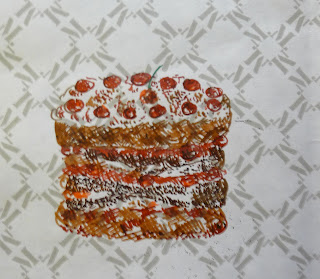
I couldn't make up my mind what to illustrate so did some of an icecream sundae and a cherry cake.
I tried drawing the item in different ways at different views with kids crayons, felt tips, oil crayons,
food colouring dyes and experimented with splatter techniques, cross hatching and stippling.
I really enjoyed this exercise and was suprised with some of the effects and will defintely use these in the future. My thoughts on each are below.
Key learning points
- I really enjoyed experimenting and think I'd like to try incorporate some of these techniques into more convential mediums.
- I liked the effect of the food dyes when it ran and think this could maybe be achieved with watercolours or other medium to create a backdrop for illustrations.
- combining the felt pens and crayon worked well and I think working over text worked well
- there would be loads more opportunities to work with these images in and with photoshop.
I couldn't make up my mind what to illustrate so did some of an icecream sundae and a cherry cake.
I tried drawing the item in different ways at different views with kids crayons, felt tips, oil crayons,
food colouring dyes and experimented with splatter techniques, cross hatching and stippling.
I really enjoyed this exercise and was suprised with some of the effects and will defintely use these in the future. My thoughts on each are below.
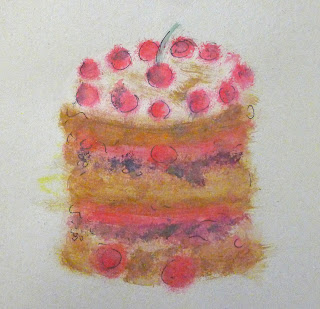 |
| Pastel paper - paints dry brush work - quite liked the effect |
 |
| Paper towel with ink and crayon - splothes from my workings |
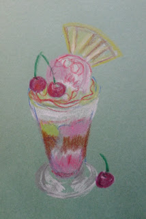 |
| Crayon on pastel paper |
 |
| Oil pastels - messy to work with on black shopping bag - liked the effect on black |
 |
| Pastel paper - felt tips and white crayon - think it worked well combining the too mediums |
 |
| felt tips added water just made page wet! |
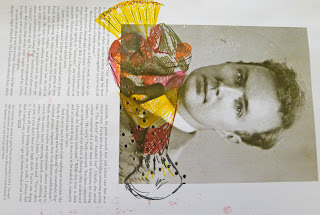 |
| Felt tips cross hatching on magazine article liked working over text interesting idea to try more in future |
 |
| crayon |
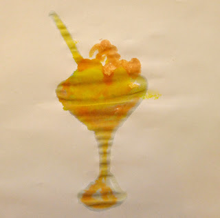 |
| Food dye on printer paper |
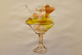 |
| Food dye printer paper - imprinted from image above - I then let the ink run and spread it out |
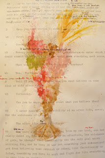 |
| Splattering paint technique by flicking onto typed article |
 |
| Felt tip on paper bag |
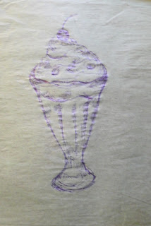 |
| Ballpoint on tissue - didn't work great |
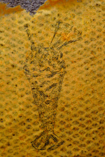 |
| Pen on handmade paper |
Key learning points
- I really enjoyed experimenting and think I'd like to try incorporate some of these techniques into more convential mediums.
- I liked the effect of the food dyes when it ran and think this could maybe be achieved with watercolours or other medium to create a backdrop for illustrations.
- combining the felt pens and crayon worked well and I think working over text worked well
- there would be loads more opportunities to work with these images in and with photoshop.
Subscribe to:
Comments (Atom)


