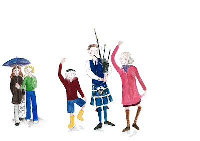
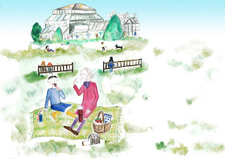
I began to think what areas/ pieces I had most success in and what areas of illustration I am most interested in. Having a look through my work to date the pieces which most jumped out at me were the POS fruit assignment, the book covers and working for children and travel guides. I particularly have become obsessed with looking at childrens picture book illustration and find that I relate most to more objective style work rather than trying to illustrate overall complex ideas or themes. I don't know if I'm quite putting it right but I find it more appealing and it comes easier to illustrate something concrete or that tells a particular story that I can visualize rather than a complex theme.
I decided to put together boards with some different work which appeals to me. I split this down into boards for childrens illustration and editorial style pieces.
I particular like the style of contemporary illustrators like Rebecca Cobb, Polly Dunbar and Bruce Ingman.
I spent quite a bit of time looking at different styles of childrens illustration and thinking about what makes the illustration appealing. A lot of the characters in these styles are relatively simplified yet have a unique charm with instantly recognisable emotions, stances and behaviours. I also considered the mediums used, how much detail was shown in the background/ the scene.
I love the work of older illustrators including Quentin Blake and John Burningham. Quentin Blake's scratchy pen and ink drawings and John Burningham's characters have a huge charm and I began to think about how important or otherwise it is to be accurate in terms of correct proportions, features etc when creating characters particular for children. I think its about being able to capture a character whether by facial features, stance etc to bring the character to life.


On my other board I identified I'm really drawn to the sort of loose styles adopted by Jill Calder and Emily Robertson who uses a lot of line with watercolour. Likewise I really like the work of Hennie Haworth who uses an almost collage like method building up layers of line with colour and background textures.

I then moved on to some brain storming of ideas in my sketchbook thinking about the Seven Days theme. As you can see I had lots of different ideas so I did some thumbnails to try out possible compositions and content.
I felt that at this stage a number of these would have the potential to work in the Seven Days context but each would probably be intended for a different audience. Deciding to take my time on the exercise I thought perhaps I could try a few of these ideas perhaps each directed towards a different group and in different styles given that I'm still exploring what styles I feel comfortable working with and those which are most successful whether more detailed , realistic, looser style etc.
As above, I decided to tackle something for children and also a more informative piece for adults.
For children I thought something which would appeal to those aged 5 -7 yet as I've discovered with some of the other work for children by the likes of Allan Alhberg, Quentin Blake etc the lines of distinction and appeal are often extended in kids books particularly with strong characters which have a broader appeal.
The ideas I had included:
- Seven Days in my week - or what I enjoyed today was ... illustrations showing what the child did each day - eg playing, cuddles with mum etc
- Seven Days as a holiday visiting a relative . Had the idea of a boy visiting Granny in Glasgow could include city pictures and what its good to see. Targeted towards kids yet educational showing some of the city with some humour.
- Seven Days - a story based on a kid waiting each day for the post. Different mail for parents ever day , waiting for post man none for him - then Sunday not expecting post but its his birthday - parents have saved up letters for him.
Adults
- Count down 7 days eg wedding
- Travel guide - was thinking 7 days in Glasgow - showing a humorous take with some serious sights eg. pipers, fish suppers and Irn Bru - some quite stereotypical , art gallery horse with cone on head
- Homeless people over 7 days watching world go by, getting meals etc. I read an interesting article on "Suspended coffee" , begging, searching for food, walkways of shops a sort of seven days in the life of to promote a homeless charity encourage sponsorship.
From all this I settled on trying out the homeless character over seven days and a kids book illustration based around seven days visiting a new city and a relative and decided to see which had more promise.
The two briefs I set myself
1)To produce a set of seven illustrations for use by a homeless charity to promote the charity and highlight the plight of the homeless. Dark / limited colours are to be used and a homeless character should feature in each illustration.
2) To produce illustrations based around Seven Days of visiting to form a short childrens book/ story. The book should appeal to children in the 5- 7 age range and feature a central character. Colours should be bright and appealing yet the image should not be overly complex.
Homeless idea tried some painting with my brush work trying to work a bit like Emily Robertson - wasn't sure it was coming together
 |
| trying to add some texture to line drawing a bit like cardboard appropriate for theme |


 |
| Thought maybe a more detailed piece could work but wasn't confident with my drawing |
Well after the work above I wasn't sure about the linear drawings and felt they looked like something a kid could produce so decided to try out and focus on the childrens book idea.
Children's book idea
Research city of Glasgow - monuments / key landmarks that someone would see in visiting the city - rain, pipers, museums, GOMA, Riverside museum
Trying to build the story
Experimenting with characters
Building it into a story - picking out key scenes
 |
| Wasn't so sure about the composition in this one and hated the building to start with |
 |
| Original drawings |
 |
| Added some Photoshop textures to liven it up |
 |
| Trying somthing a bit John Burningham style adding actual photo not sure it works |
 |
| Decided to do a sort of snapshot idea to get multiple Glasgow venues in one illustration |
 |
| Original - should I add a background or leave?? |
 |
| Added photoshop textures some shading - think it brings it together better |
 |
| Original illustration - watercolour and pencils with crayon |
I was considering as I started this how to outline my characters. I felt that pen and liners would look too harsh so I used some oil based hard pencils with small areas of fineliner.
 |
| Combined two drawings to make one scene/ final illustration in the book - added Photoshop - texture to floor and pjs gives drawing a bit more interest |
Final book with words also included a front cover illustration


Overall, I am fairly happy with my Seven Days childrens story with Ben visiting his Granny in Glasgow. I think the characters are relatively appealing, the locations are recognisable as being in Glasgow and I've tried to experiment with some different techniques to keep the story interesting.
I tried to experiment with drawing characters but this is a huge area I know I can continue to work on. Likewise, looking at other childrens books/ illustrations I would like to become more confident adding background scenes to set my characters in context/ tell a story. There is a balance to strike between not overly complicating the illustration, making the character stand out from the backdrop whilst making sure they work in harmony or alternatively manage to work despite their contrast (eg Lauren Child books etc).
Alternatively illustrators like Quentin Blake and Polly Dunbar tend to keep backgrounds relatively plain yet manage to create fantastic character illustrations which don't need much else to get the story across.
Illustrators such as Emma Chichester Clark create very detailed illustrations with strong colours and details and this is another area I would potentially like to work on. I think that with continued experimentation and practice of both painting and drawing techniques (tonal work and character drawing) I can develop and improve my illustrations.
After tutor report
 |
| NOT SURE TOO MUCH ? ADDED SOME WALLPAPER |
 |
| SCALED BACK COLOUR BACKGROUND ALTERED POSITIONING IN FRAME |
 |
| REMOVED BLUE BACKGROUND?? |
 |
| NOT SURE ABOUT THIS ONE?? - TUTOR SUGGESTED LOOKING AT ANGLE OF PHOTOGRAPHS NOT SURE THINK I PREFER ORIGINAL POSITIONING |
Most successful reworked images
Texture added wording colour changed
No alterations - ideally these would be on separate pages
Redrew this image/ painted so that the building and the boat weren't in conflict with each other - think the composition is more successful.
Texture and gradient added.
Subtle background texture added
Added a background to give the image a sense of grounding - added the chair to the left handside to balance the composition. Added subtle table cloth with drop.
Added ground and slight textured backdrop


